Daneshjooam: turning dense requirements into calm, findable flows
RoleUI/UX Designer
CompanyRahavard Hamrah Ofogh
PlatformsDesktop, tablet, mobile
ToolsFigma, Material 3
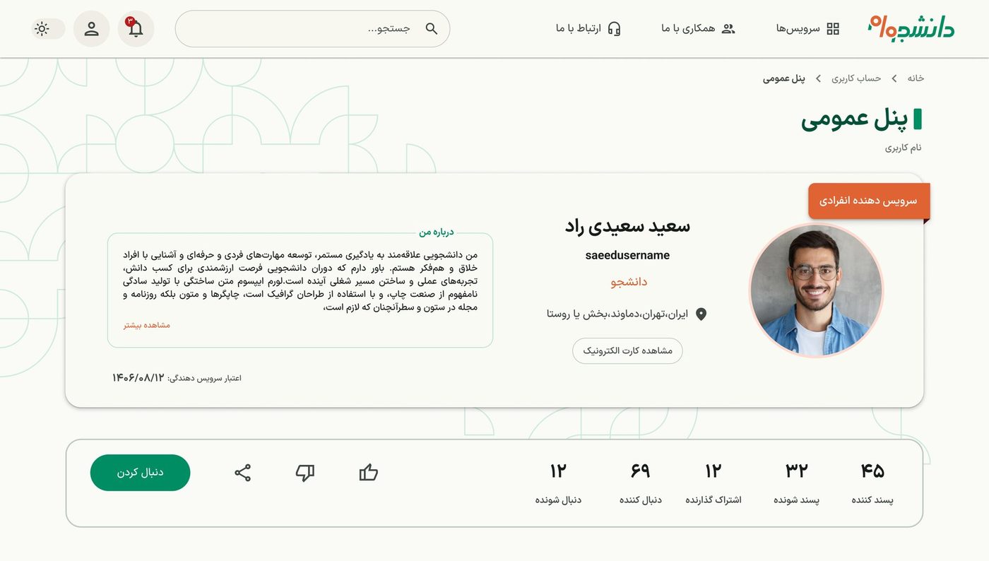
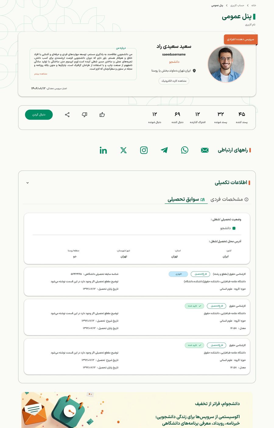
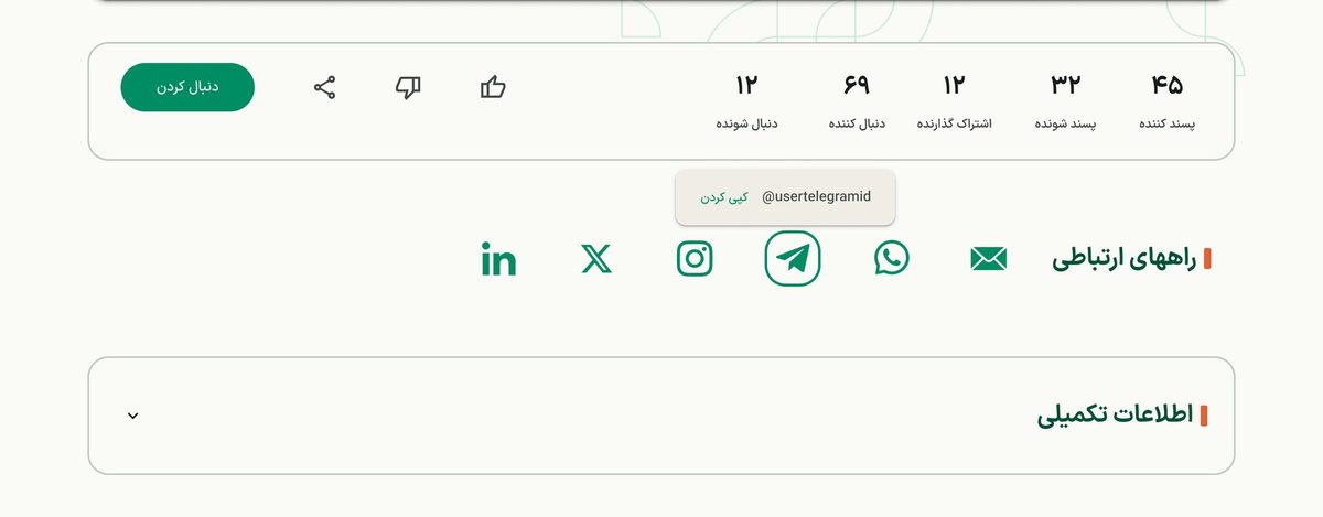
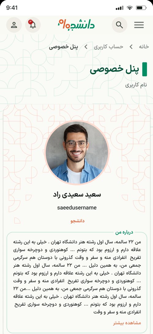
The public profile: identity card, stats and actions. Screens use sample data.
At a glance
The problem
A multi-service platform with dense requirements, lots of data, and two roles (user and admin) on the same pages.
What I did
Turned long pages into tabbed panels, replaced after-the-click errors with status before the click, and designed one profile layout that adapts to any amount of content.
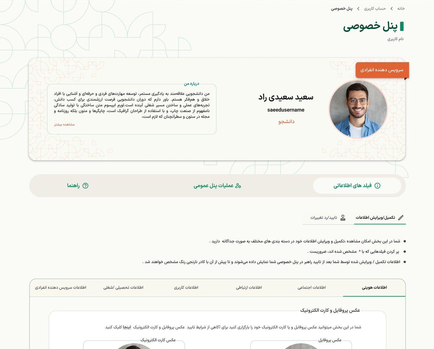
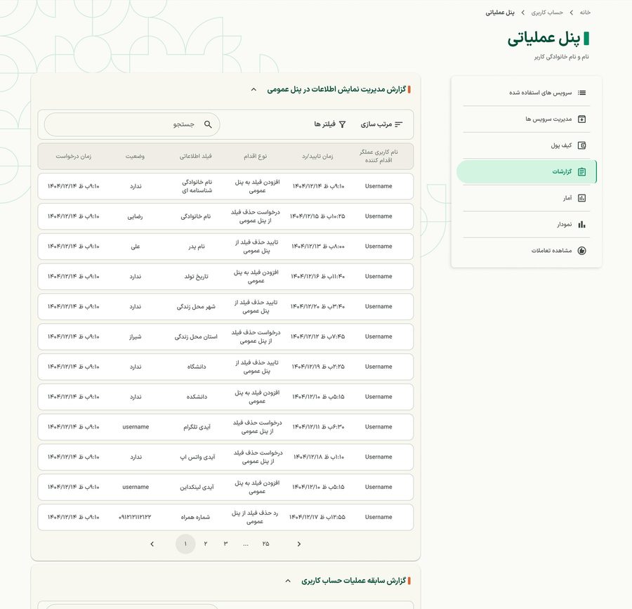
Information architecture under heavy requirements. The private panel first stacked everything on one long page. Over several iterations with my managers we moved to tabs grouped around what people come to do. In the service operation panels, one rule keeps navigation predictable: separate pages get a sidebar item, sections inside a page become tabs, and dozens of reports sit in collapsible sections.
Private panel: main tabs, sub-tabs, and the fields of one category.
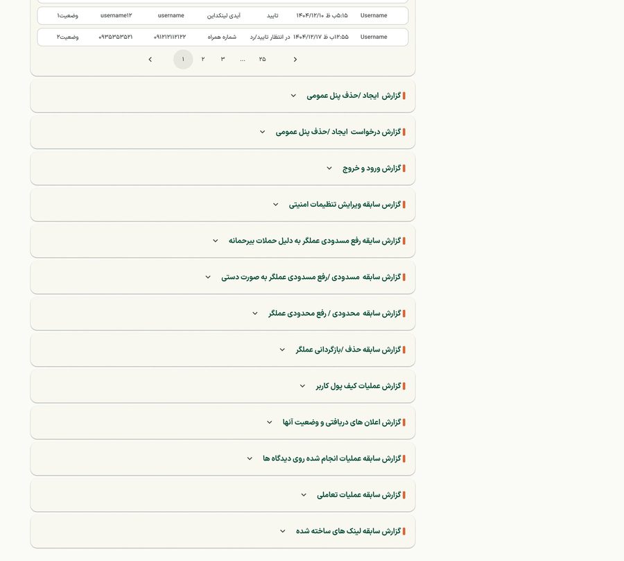
Operation panel: sidebar, one report open.The remaining reports, collapsed.
2
Status before the click, not errors after it. The spec for creating or deleting a public panel showed errors only after a button was pressed. I proposed showing the user's status up front, disabling impossible actions with a short reason and next step, and keeping confirmation dialogs for real decisions. Currently under review with the team.
3
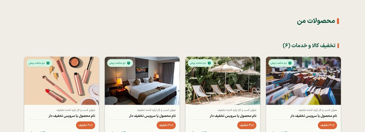
Deep dive: designing for variable content density. The public profile holds personal details, contacts, education and provider content, much of it optional. One structure had to work for an almost empty profile and a very rich one, without removing required information or inventing new components.
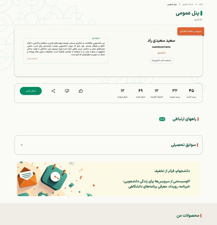
Rich profile: additional information open, with tabs.Minimal profile: one contact, one section.
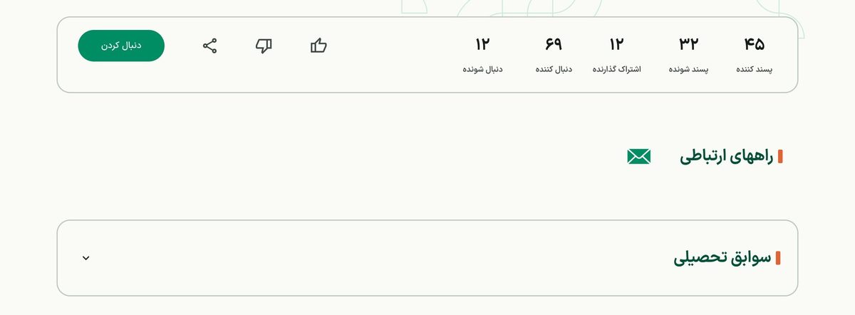
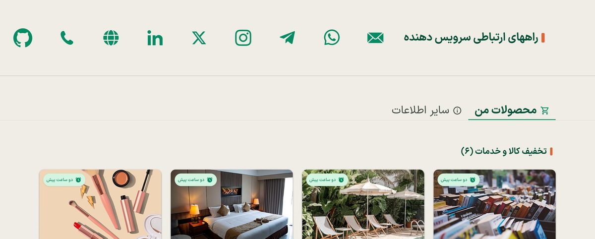
A lone icon has no context. With only email, a single icon looked isolated. I kept the compact icon row and added an inline "Contact methods" heading on the same line. Click opens a popover with a copy action; hover shows only the channel name, because interactive content never lives on hover.
One channel: heading and icon read as one unit.Many channels, with the popover open.
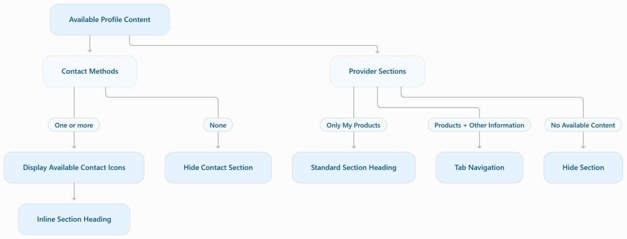
A tab bar with one tab. One section gets a standard heading, two get the existing tab component, none is hidden. Tabs start where the heading starts, so content begins in the same place in every state.
One section: a heading.Two sections: tabs.
The display rules. After more than ten iterations, the latest version is under review with the team.
4
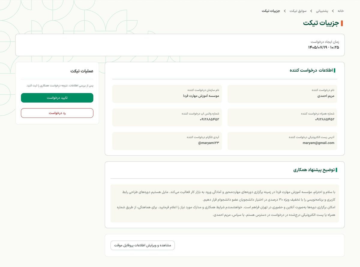
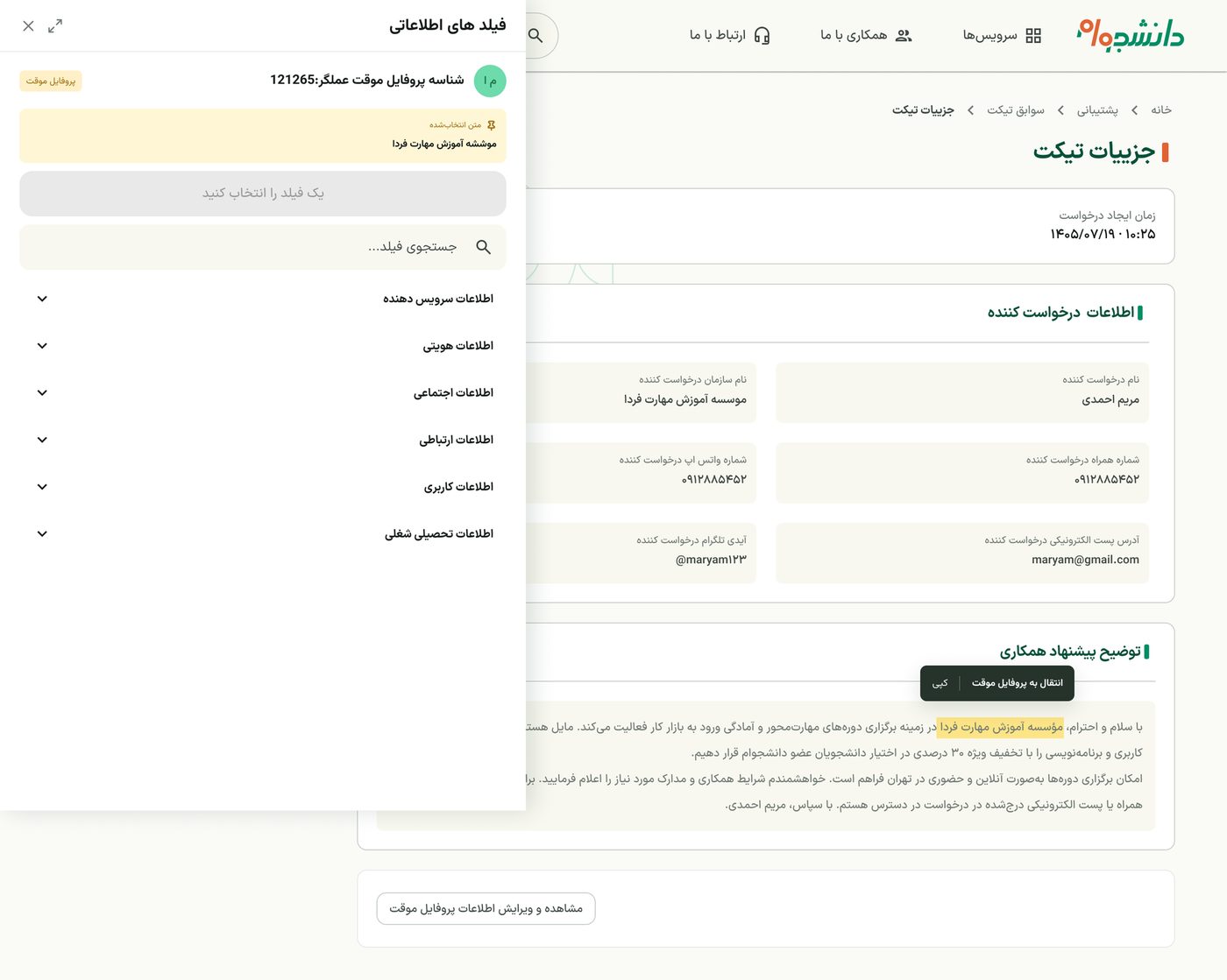
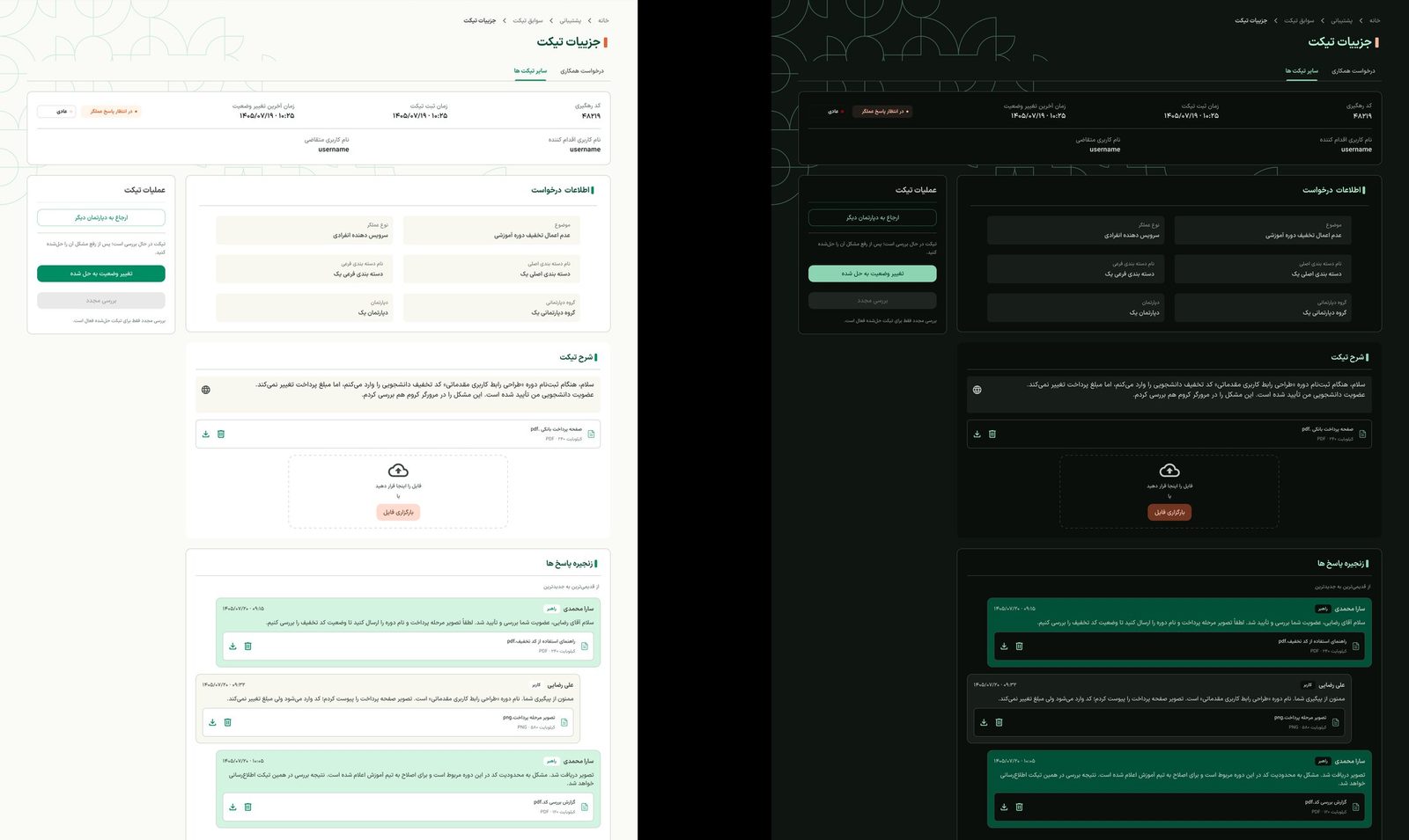
Two roles in one interface. The admin panel is a separate system, but the team moved some admin actions into the user-facing site. I designed them so the same pages serve the user and an admin: ticket details with internal notes, a searchable referral dialog, and a way to move text from a ticket into a user's profile without losing context.
Ticket details, with actions.Moving ticket text into a profile.
5
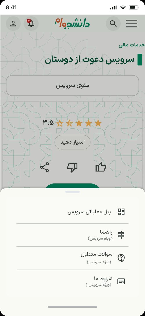
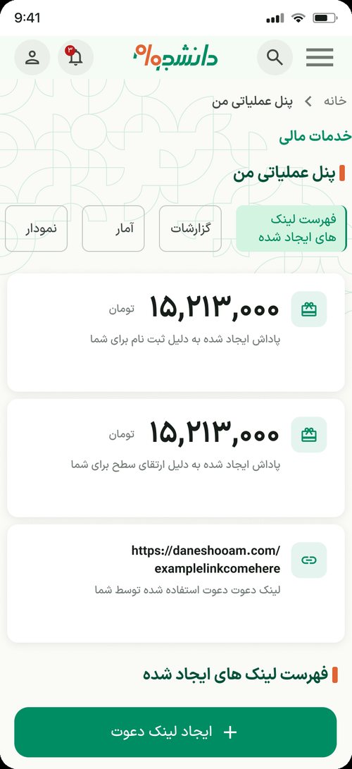
The same depth on a phone. Every feature works on tablet and mobile; only the pattern changes. The global menu is always one hamburger. A service's own menu becomes a button that opens a bottom sheet, so there is never a second hamburger, and the sections of a panel become a scrollable row of chips.
Private panel.Service menu as a bottom sheet.Operation panel: sections as chips.
6
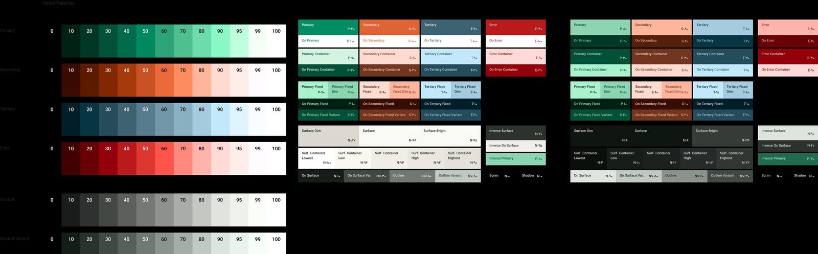
A colour library for light and dark. I built dark mode on Material 3's colour system as Figma variables, replaced the defaults with the brand palette, checked every dark equivalent, and added custom colours where Material's roles weren't enough.
Tonal palettes and colour roles, light and dark.Ticket details in light and dark mode.
What I learned
Detailed requirements are not the enemy of simplicity. The work is in deciding when to show each rule: before the click, at the moment of decision, or not at all.
Case study · Open source
Yaadegar: designing a gift list that keeps the surprise
RoleUI/UX Designer
TimelineAug 2026 · 2 weeks
Scope10 screens + landing
ToolsFigma, Figma AI
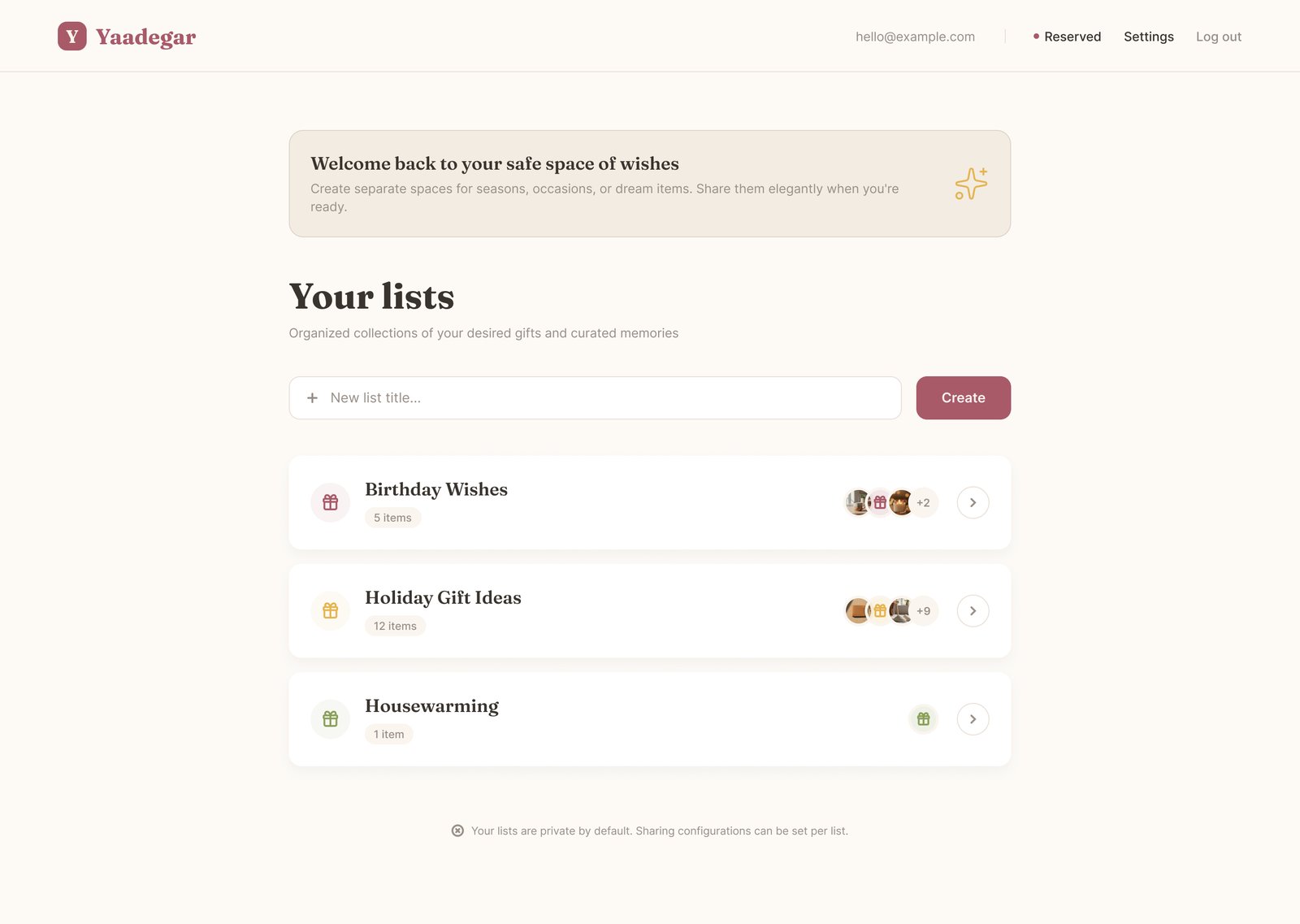
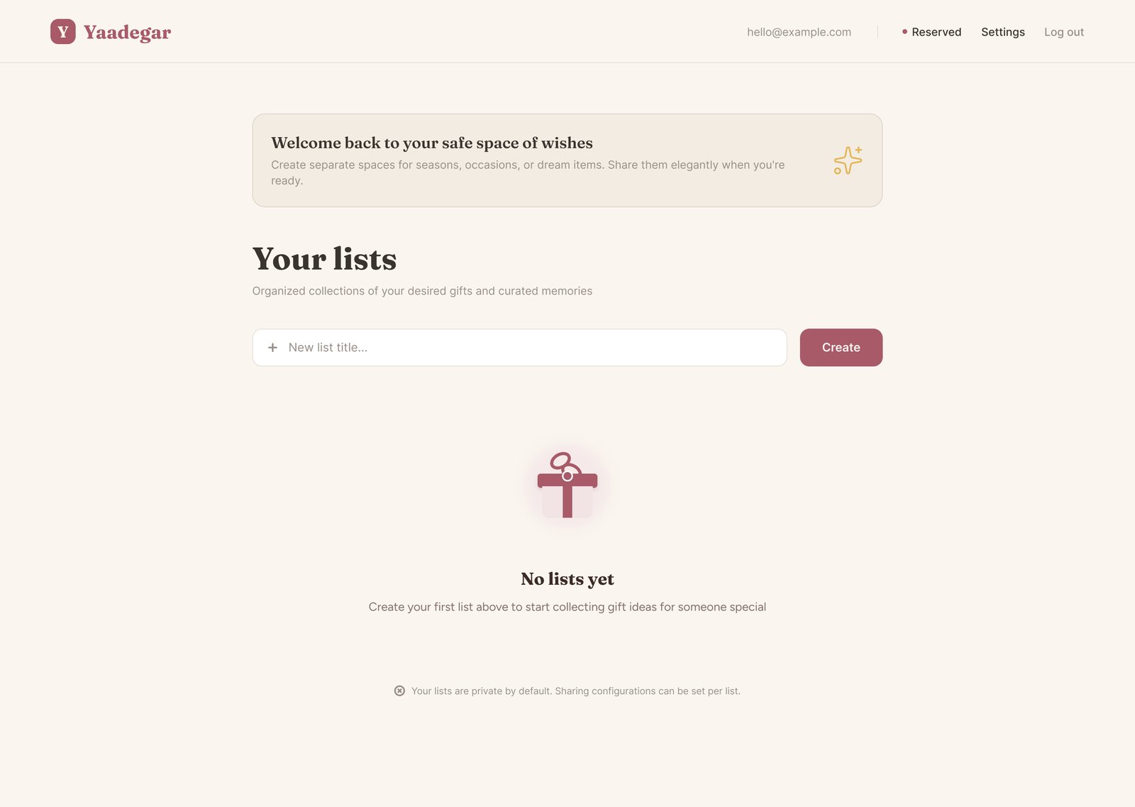
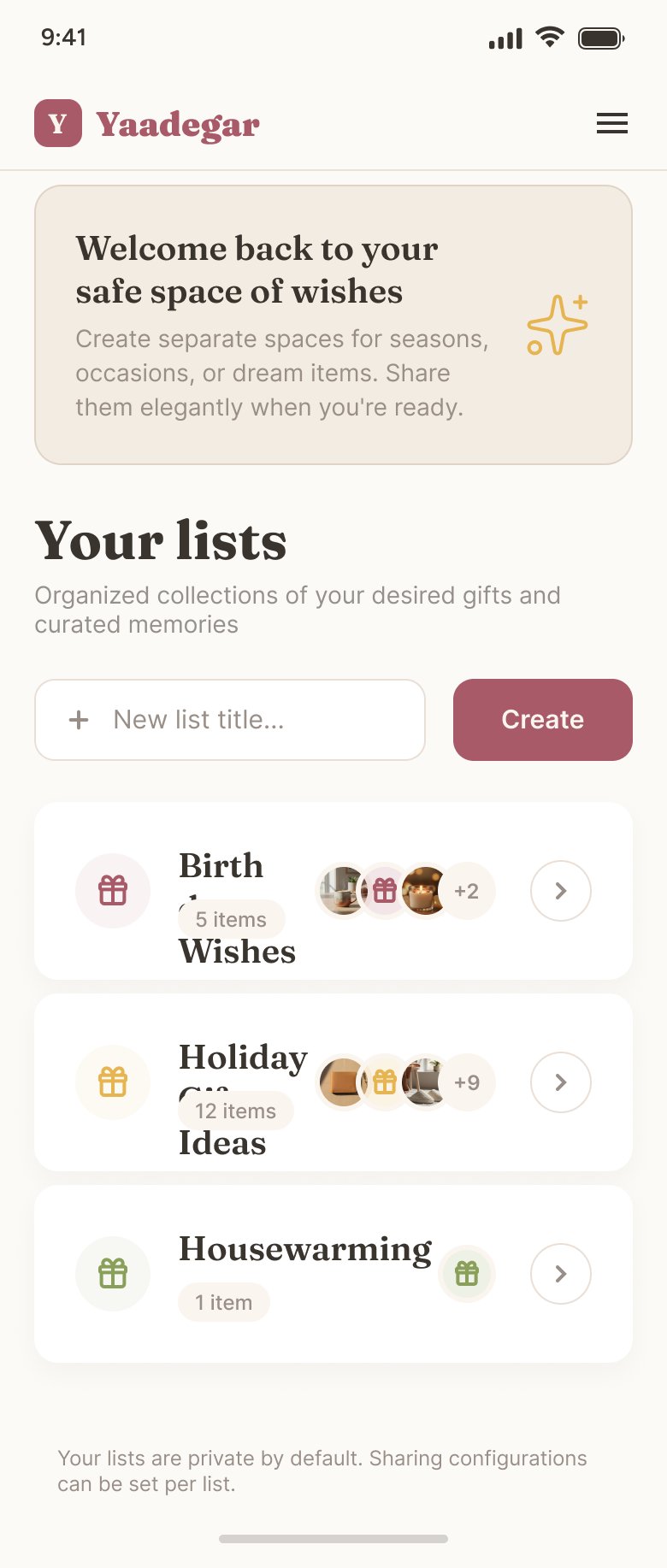
The owner's dashboard: every list at a glance, with item counts and who has been invited.
The product
Yaadegar is an open-source, self-hosted gift-list app. People create wishlists for birthdays or housewarmings and share them with friends, who reserve a gift so nobody buys the same thing twice.
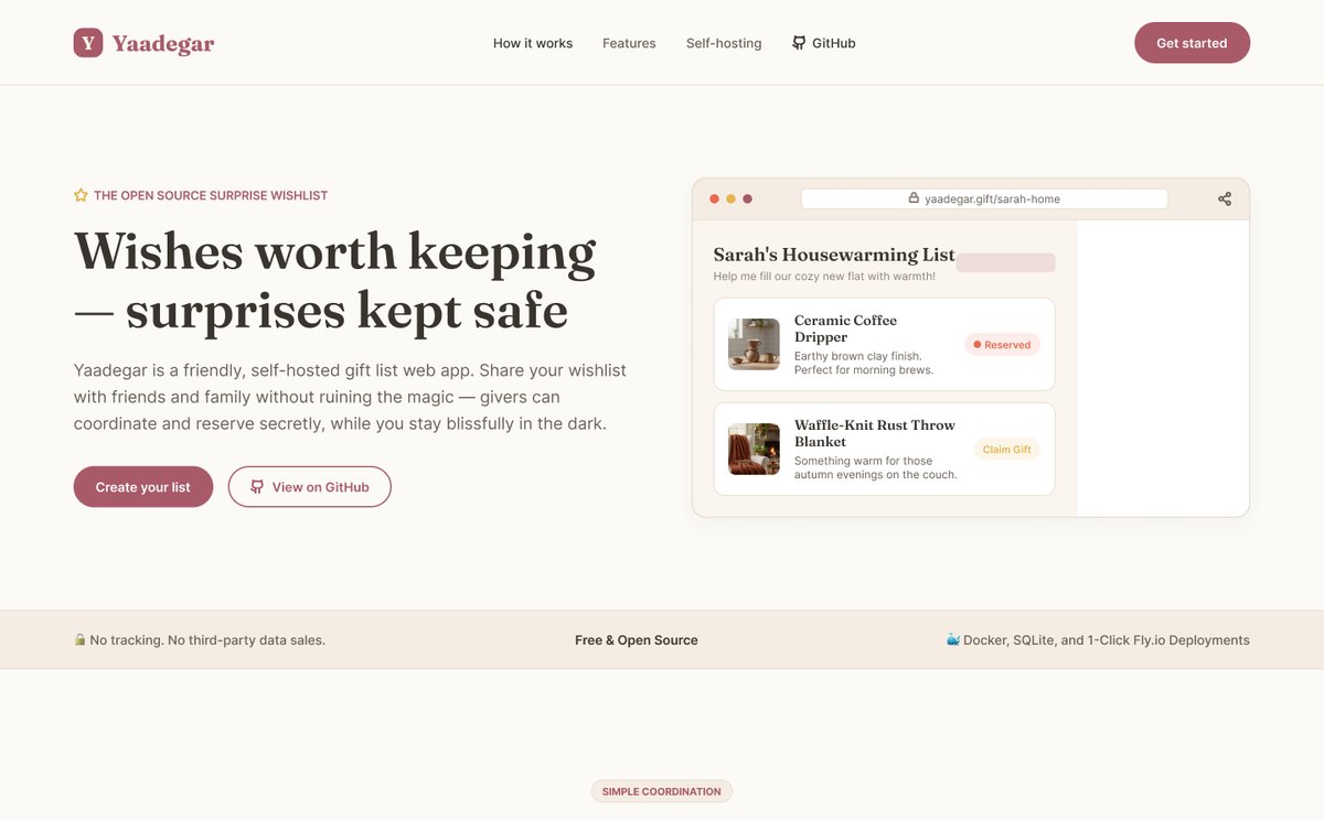
When I joined, the app worked but had no design at all: plain black-and-white HTML. My job was to give it a complete experience and visual identity, from login to the public gift page, plus a landing page for the project.
The landing page: "Wishes worth keeping, surprises kept safe."
One list, two very different people
The owner
Creates and manages the list, and must never see what has been reserved, or the surprise is ruined.
The giver
Opens a shared link, often on a phone and without an account, and needs to know in seconds what's available and how to reserve it.
The same list needed two views with different information, permissions and tone, and the hidden reservations had to feel natural, not broken.
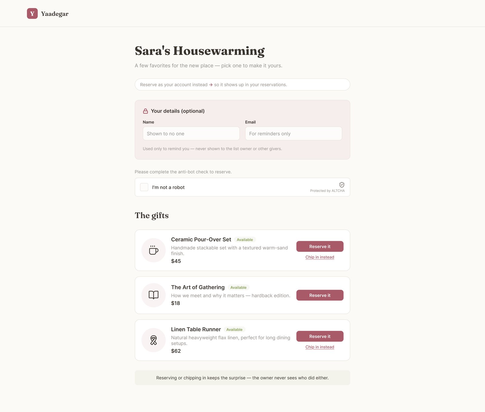
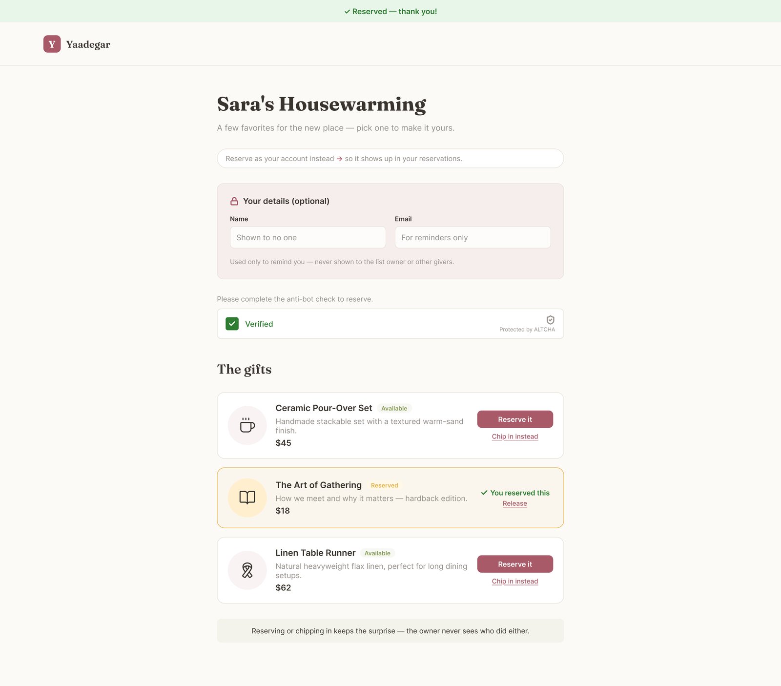
Two views, designed separately. The owner view is a calm workspace for adding and organizing. The guest view is a welcoming page built around one action: Reserve it. Owners never see reservation status; guests see clear Available and Reserved states.
Guest view: gifts available to reserve.After reserving: a clear confirmation, and a way to release it.
2
Reserving without an account. Guests shouldn't have to sign up. I framed the optional "Your details" card with a lock and a short privacy note, plus a light human check, so it never feels like a registration wall.
3
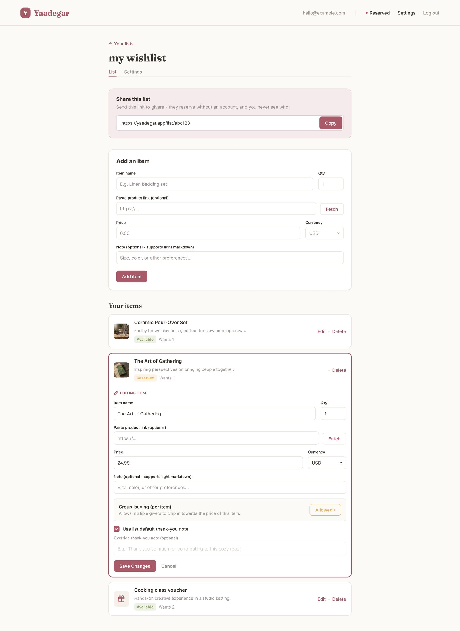
Inline editing. Instead of a separate edit form, clicking Edit expands the item card in place, so owners keep their context and see the result immediately.
Owner list view with an item open for inline editing.
4
A warm visual direction. Gift lists are emotional, so I avoided a cold dashboard look. We chose a warm, elegant direction: cream, rose, olive for Available, gold for Reserved, with Fraunces for headings and Inter for text.
Cream
Rose
Available
Reserved
Ink
5
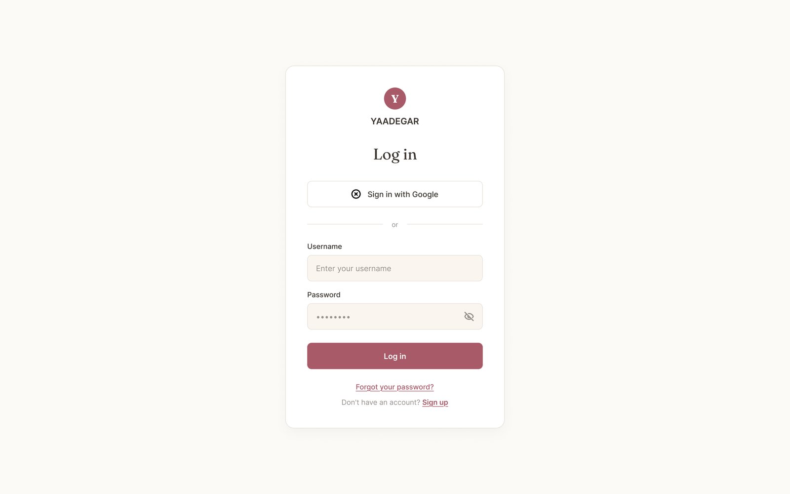
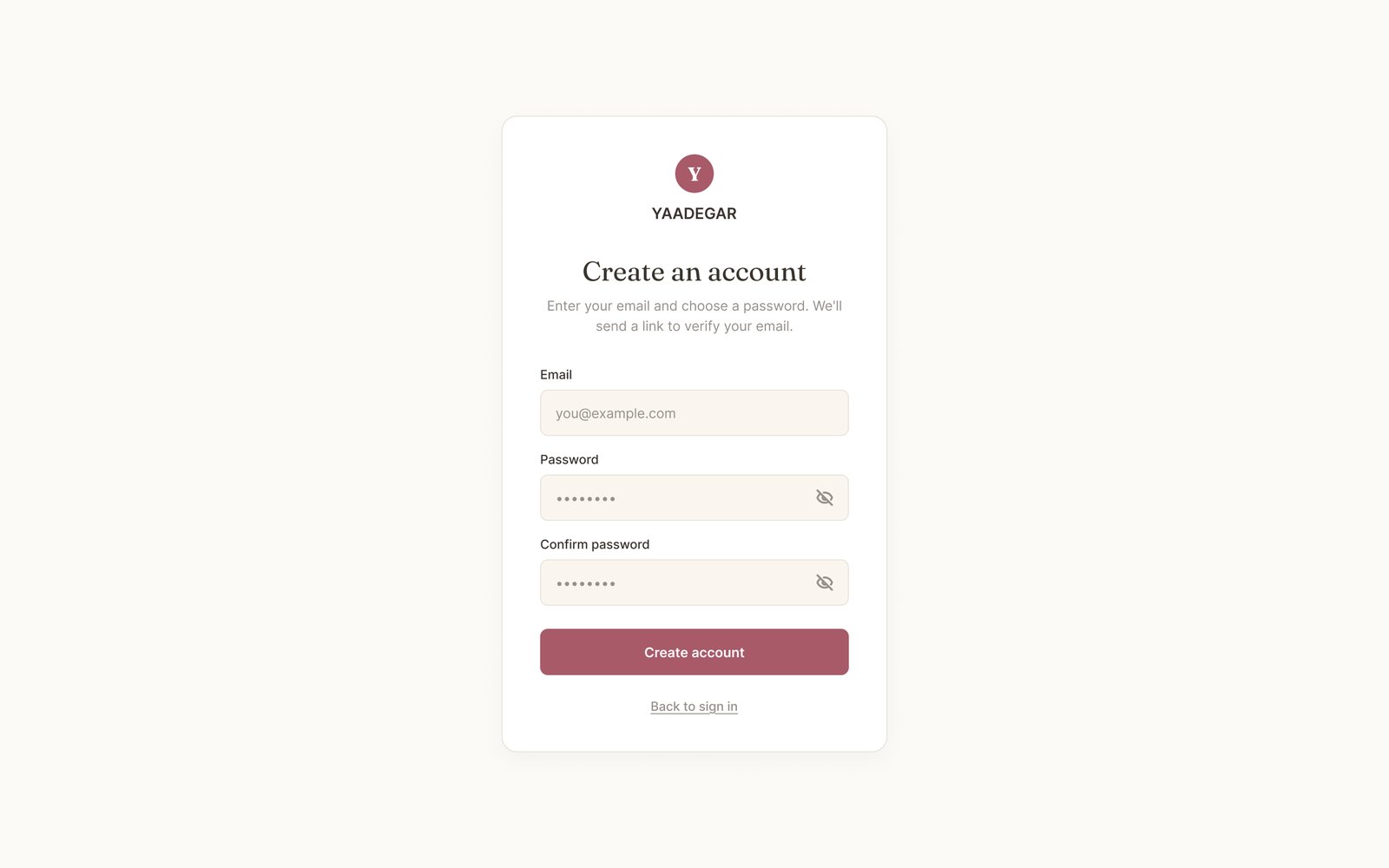
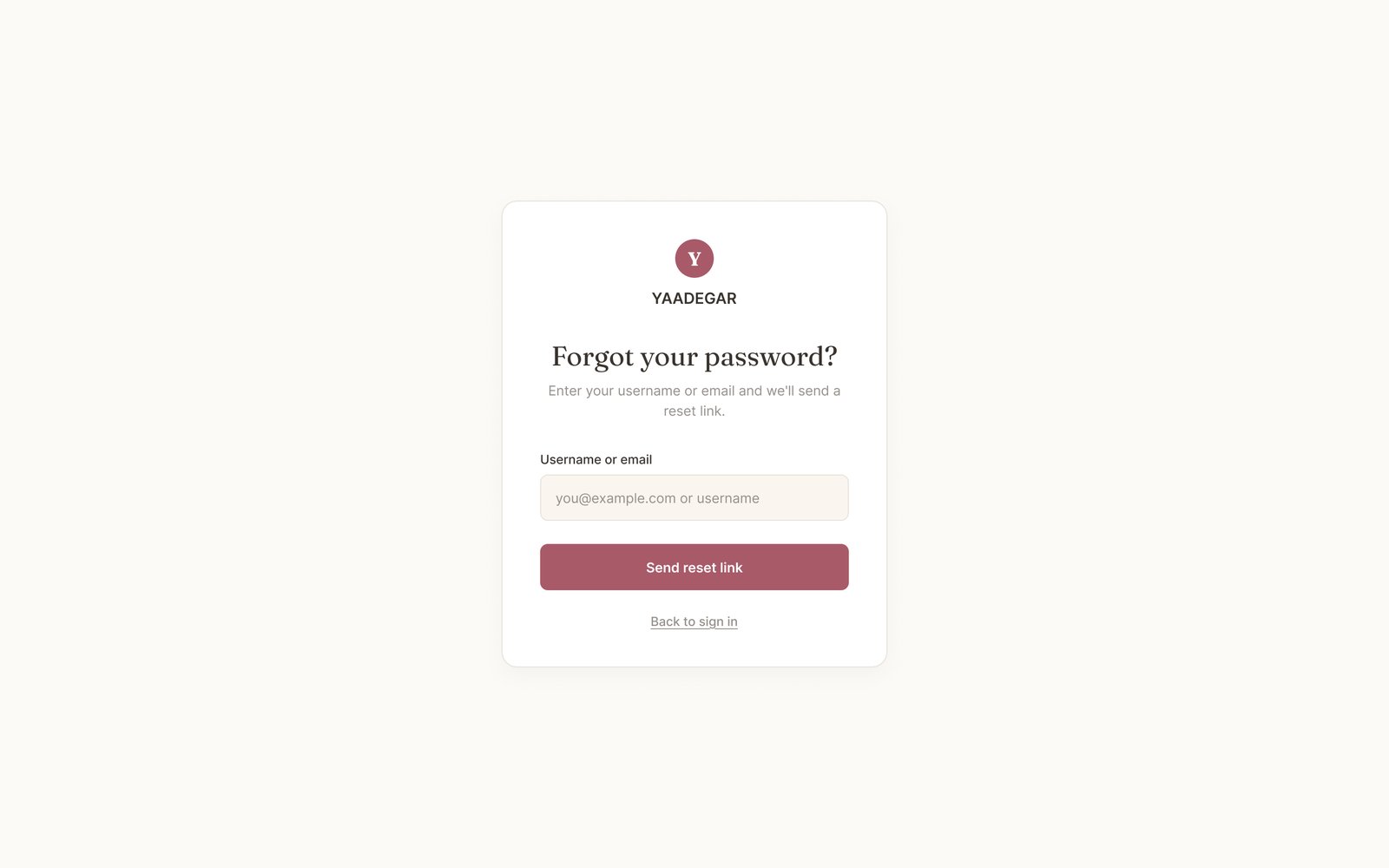
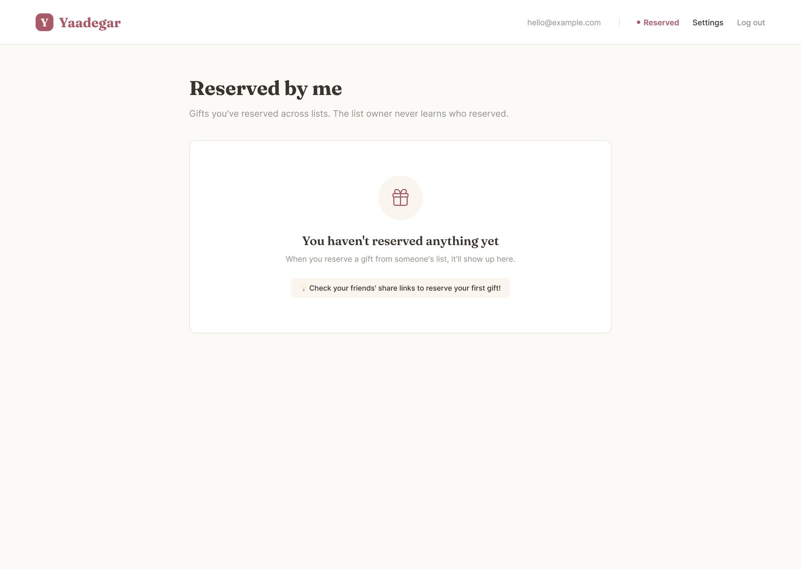
Every state, not just the happy path. Empty states, image fallbacks, sign-in, sign-up and password recovery all share one calm pattern, on desktop and mobile.
Log inCreate accountForgot password
Empty state: a friendly first step.Nothing reserved yet.
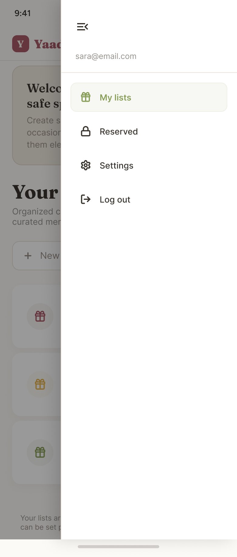
Mobile dashboardMobile menu
Handoff and outcome
I handed the screens to the developers with a view-only Figma link, the design tokens and a frame list, so they could build straight from Dev Mode.
A complete, consistent UI for a real open-source product: 10 core screens and a landing page
A clear owner and giver model that protects the surprise
A visual language and components the team can extend, with dark mode planned next
What I learned
Start every screen with one question: who is looking at this, and what must they not see?
About
I'm a UI/UX designer based in Tehran. Since 2024 I've designed Daneshjooam, a multi-service student platform, where I work on everything from information architecture to admin tools and a Material 3 design system.
Before design, I spent ten years as an electrical engineer and project manager. It taught me to work with structure, care about detail, and stay calm with stakeholders. I also code in HTML, CSS and JavaScript, and I paint.
2024 – nowUI/UX Designer, Rahavard Hamrah Ofogh
2026UI/UX Designer, Yaadegar (open source)
2022 – 2023UI/UX Designer (Intern), Atrin Co.
2008 – 2018Electrical engineer and project manager